Do You Really Know How to Use Mockups? Discover the Most Common Mistakes
Using mockups might seem easy, but the truth is, many designers make mistakes that end up devaluing their own projects. And often, the problem isn’t the design itself — it’s how it’s presented.
If you want to truly make an impact with your client deliveries and portfolio, it’s worth paying attention to these common mockup mistakes — and learning how to avoid them.
1. Choosing mockups that don’t match the project’s style
A sleek, modern design placed in an outdated or overly stylized mockup can create a weird contrast and weaken the visual impact.
How to avoid it:
- Consider the project’s style (minimalist, playful, elegant…) and choose mockups that align with it
- Prefer mockups with neutral lighting, angles, and colors that can adapt to different design directions
2. Using generic or outdated mockups
Mockups with outdated props, awkward angles, or low resolution make your project look amateurish.
How to avoid it:
- Choose mockups that reflect current design trends
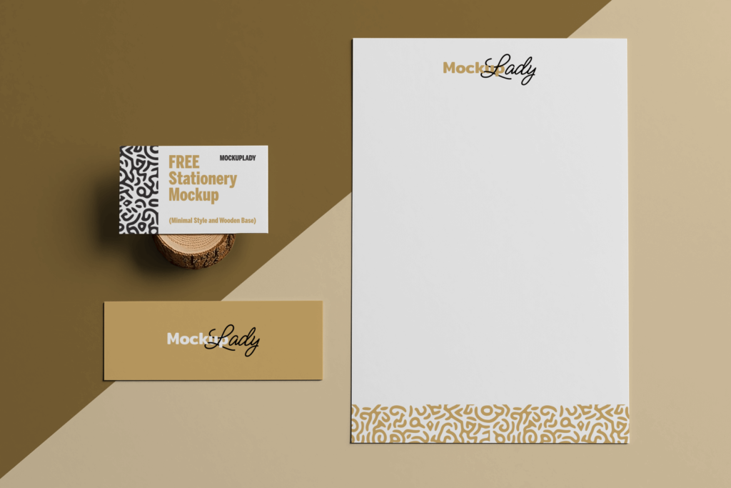
- Look for more realistic references — like the free ones available on Mockup Lady
3. Placing the design with poor scaling or alignment
Nothing devalues a project faster than a stretched logo, misaligned layout, or wrong perspective in the mockup.
How to avoid it:
- Use Smart Object mockups (they automatically adjust your design to fit the layout)
- Always double-check proportions and alignment before exporting
4. Using too many mockups without strategy
Showing the same project in 7 different mockups might feel excessive — and worse, it can overwhelm the viewer.
How to avoid it:
- Select 2 or 3 mockups that showcase different applications (e.g., stationery, storefront, digital)
- Show variety with balance
5. Ignoring the mockup’s environment and context
Placing a youth-focused design in a corporate office scene, for example, breaks the consistency of the visual storytelling.
How to avoid it:
- Think about the brand’s audience and world before choosing your mockup
- A well-chosen, realistic setting reinforces the narrative of your design
6. Skipping visual edits on the mockup
Many mockups allow you to tweak shadows, lighting, textures, or background colors — leaving everything as-is can hurt the final aesthetic.
How to avoid it:
- Customize the mockup to suit your project: adjust the background, fine-tune opacity, refine small details
- Presentation is part of design!

7. Using low-quality mockups
Pixelated images, poor resolution, or badly cropped scenes can ruin the entire visual impact.
How to avoid it:
- Always check the resolution (2,000px or higher is ideal)
- Choose professional mockups — like the free, high-quality ones from Mockup Lady
Mockups are powerful tools to enhance your design work — as long as you use them with strategy and visual care. The mistake isn’t using too many mockups, but using them the wrong way.
With the tips in this article and the free resources from Mockup Lady, you’ve got everything you need to turn your projects into real visual showcases.
Explore our free mockups at mockuplady.com and create presentations that speak for themselves!